Designing for
accessibility

ABOUT

Citizens Financial Group delivers a broad range of financial services to millions of individuals, companies, non-profits, and institutions.


PROBLEM

Users were having a hard time distinguishing snackbars from the rest of the content (not enough color contrast).


OPPORTUNITY

Fix this known color contrast / accessibility issue before code freeze.


CONSTRAINTS
  • Resources: our user research team was fully booked for the next few weeks.
  • Time: we had 2 weeks before code freeze.

RESPONSE
As the lead product designer, I was responsible for:
  • Researching how competitors present snackbars and banner messages.
  • Designing several variations of snackbars and banner messages.
  • Creating interactive prototypes in Figma.
  • Conducting A/B testing with 350 participants to better understand user preferences.
  • Conducting unmoderated tests with 15 participants to see which snackbar design is most visible to users.
  • Analyzing, documenting and sharing customer insights with stakeholders across the organization.

OUTCOME

Insights from user testing provided us with a clear direction. The dark green snackbar was selected as the final design.

DELIVERABLES
  • Visual designs
  • Prototypes
  • Findings from user research
Moving from wireframes into polished visual designs.
KEY METRICS

50%+

Increase in snackbar visibility during user testing.
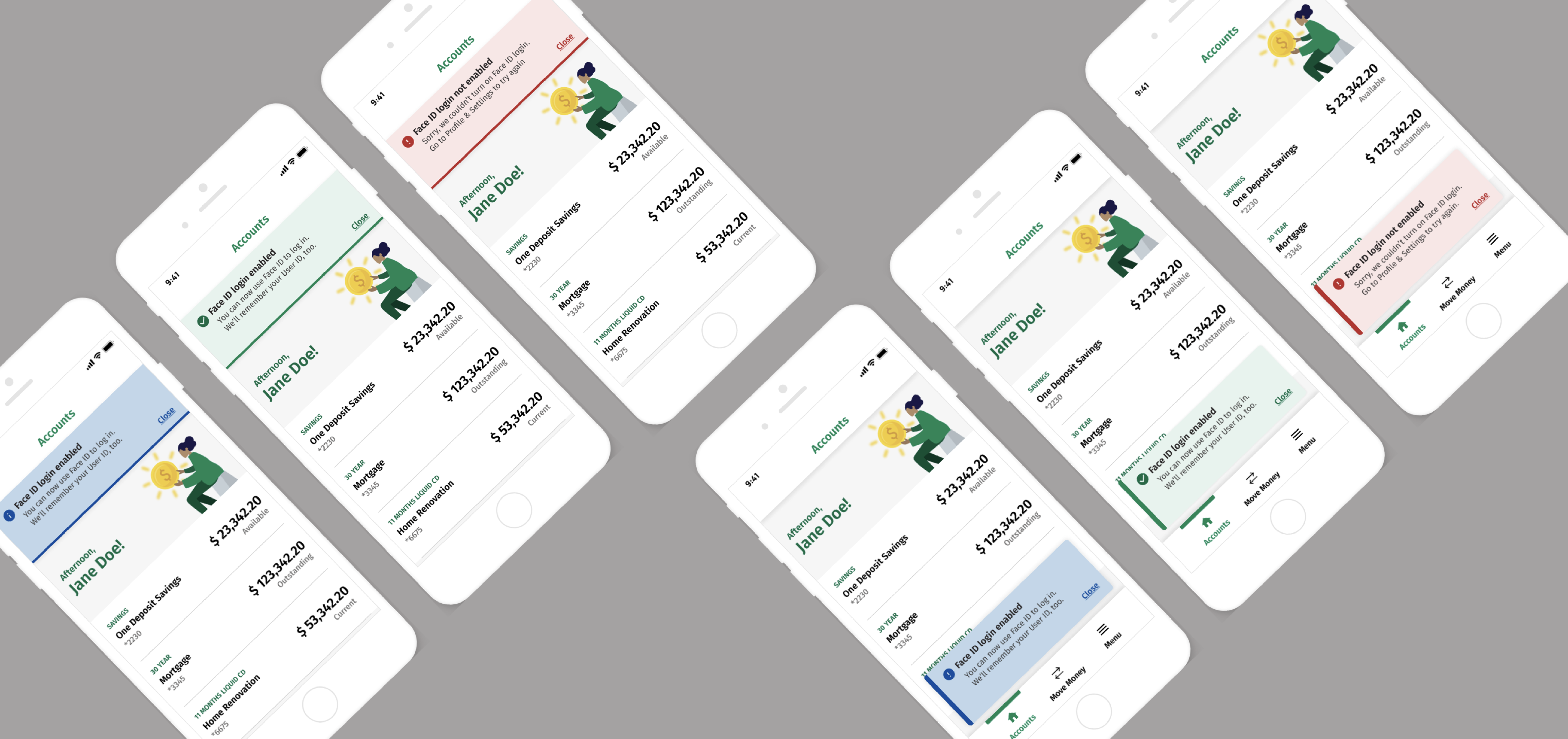


TESTIMONIAL

"Thank you, Hugo, for being an excellent teammate on the National Banking initiative. You have continued to connect and collaborate with your peers and have been an active contributor. You share your work and include others in your process, and share your insights."